- Benchmark Category Comparison
- Close Account Analysis
- Cost Top 10
- Cost Trend
- Institution Trending Prior Quarter
- Interest
- Member
- Net Contribution Growth Comparison
- New Loan Weighted Interest Rate
- Open Account Analysis
- P&L
- Percent of Net Contribution
- Process Account Analysis
- Product Management Summary
- Product Summary
- Products per Account Holder
- Revenue Top 10
- Revenue Trend
- Segmentation Drilldown
- Total Average Net Contribution
- Waived Fees
 |
Unless otherwise indicated, all view details are provided from the All Products level. |
Benchmark Category Comparison
The Benchmark Category Comparison contains two separate views that display twelve bar charts comparing the performance of the financial institution against the average of all peers and the average of the top three peers for the standard products and categories.
|
The Benchmark Category Comparison analytic is unable to render at the All Products level or for any institution specific product categories and account types. It can only be selected at the product level and for the first four category levels within each product. |
The data displayed in the analytic can be filtered according to a month, quarter or year roll-up.
- If the date range is a year and either the Quarter or Year Roll-Up option is selected, the Benchmark Category Analytic represents the averages for that year.
- If the date range is a quarter and the Quarter Roll-Up option is selected, the Benchmark Category Analytic represents the averages for that quarter.
- If the date range is custom and the Month Roll-Up option is selected, only the data for the last month in the date range is represented in the results. However, if the date range is custom and either the Quarter or Year Roll-Up is selection, the data for the entire date range will be represented in the resulting charts.
|
This analytic does not display quarter to quarter or year to year comparisons. Instead, each category chart shows the averages for the institution, top three peers, and all peers for the entire date range entered or selected. |
The top three peers are chosen based on Net Margin of the institution and not the selected product. Both financial and non-financial KPIs are displayed.
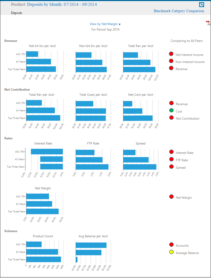
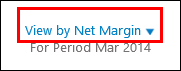
By default, the View by Net Margin view displays. This view displays the Benchmark Category Comparison charts by the top 3 peers based on Net Margin at the institution level. The top three peers remain the same for all twelve charts included in the view. The View by Category displays the top three peers based on the data for each chart. The financial institutions comprising the top three peers can be unique for all twelve charts included in the view.
The Benchmark Category Comparison view includes the following information:
Revenue:
| KPI | Description | ||
| Net Int Inc per Acct |
Displays a financial institution's net interest income per account as well as all their peers and top three peers.
| ||
| Non-Int Inc per Acct |
Displays a financial institution's non-interest income per account as well as all their peers and top three peers.
| ||
| Total Rev per Acct |
Displays a financial institution's total revenue per account as well as all their peers and top three peers.
|

Net Contribution:
| KPI | Description | ||
| Total Rev per Acct |
Displays a financial institution's total revenue per account as well as all their peers and top three peers.
| ||
| Total Costs per Acct |
Displays a financial institution's net costs per account as well as all their peers and top three peers.
| ||
| Net Cont per Acct |
Displays a financial institution's net contribution per account as well as all their peers and top three peers.
|
Rates:
| KPI | Description | ||
| Interest Rate |
Displays a financial institution's interest rate as well as all their peers and top three peers.
| ||
| FTP |
Displays a financial institution's FTP as well as all their peers and top three peers.
| ||
| Spread |
Displays a financial institution's spread as well as all their peers and top three peers.
| ||
| Net Margin |
Displays a financial institution's net margin as well as all their peers and top three peers.
|
Volumes:
| KPI | Description | ||
| Product Count | Displays a financial institution's product count as well as all their peers and top three peers. | ||
| Avg Balance per Acct |
Displays a financial institution's average balance per account as well as all their peers and top three peers.
|
|
If the Net Contribution or Total Revenue is less than or equal to zero then the Net Margin is blank in the analytic. |
Comparing to All Peers:
This section displays a “traffic light” graphic to quickly identify an institution's performance relative to its peers, based on a color-coded scale.
- Green -An institution is performing well in comparison to its peers.
- Yellow - An institution is performing comparably to its peers.
- Red - An institution is performing at a level below its peers.
This scale is displayed for each graph displayed within the Benchmark Category Comparison view.
|
If no peer data is available, the following message renders:
|

The data within this view can be exported to PDF format.
|
For information on exporting view data to PDF, see the Navigating Views topic. |
Click the View by drop-down to change the view displayed in Benchmark Category Comparison.
Close Account Analysis
The Close Account Analysis displays the number of accounts closed as well as the associated costs of each product during the selected time period in the hierarchy (one level below the selected product). Closed accounts and costs for the selected product are further delineated by channel.
The Close Account Analysis view includes the following information:
| KPI | Description |
| Number of Accounts Closed by Product | A stacked column chart that shows the number of accounts closed for each product in a hierarchy that is one level lower than the selected product during the selected time period. |
| Cost to Close Accounts by Product | A stacked column chart that shows the closing cost of accounts for each product in a hierarchy that is one level lower than the selected product during the selected time period. |
| Number of Accounts Closed by Channel | A stacked column chart that shows the number of accounts closed for the selected product for each channel during the selected time period. |
| Cost to Close Accounts by Channel | A stacked column chart that shows the closing cost of accounts for the selected product for each channel during the selected time period. |
| Costs per Channel | A pie chart that shows the total closing cost of accounts for the selected product for each channel during the selected time period. |
The data within this view can be exported to PDF format.
|
For information on exporting view data to PDF, see the Navigating Views topic. |
Cost Top 10
The Cost Top 10 view displays the top ten drivers that impact revenue, based on the absolute value of all revenue items. These revenue items are sorted in descending order according to their absolute value displayed in the Total column. The first and last periods of the date range chosen are displayed, along with the variance between these periods. The period total and period averages are also shown.
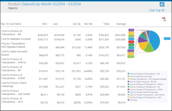
The Cost Top 10 view also displays the dollar amount of the top ten cost P&L line items based on their numerical size for the selected period start, total, average and end. The pie chart shows the relative size of the top ten cost items along with all other cost items aggregated together.
|
If there is no data to display, the chart/graph indicates no data is available. |
|
In some cases, percentages are too small to display a graphical representation on the chart. However, users are able to view these small values by hovering over the Y axis. |
The data within this view can be exported to PDF format.
|
For information on exporting view data to PDF, see the Navigating Views topic. |
Cost Trend
The Cost Trend view displays the total costs of the selected product and time period. The costs of the selected product are further detailed by the following types: Processing, Maintenance and One-Time (Open and Close) costs.
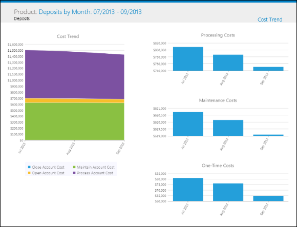
The Cost Trend view contains the following information:
| KPI | Description |
| Cost Trend | A stacked area chart that shows the costs for the selected product and time period detailed by cost type: Processing, Maintenance and One-Time (Open and Close) costs. |
| Processing Costs | A column chart that shows the processing costs for the selected product and time period. |
| Maintenance Costs | A column chart that shows the maintenance costs for the selected product and time period. |
| One-Time Costs | A column chart that shows the one-time costs for the selected product and time period. |
The data within this view can be exported to PDF format.
|
For information on exporting view data to PDF, see the Navigating Views topic. |
Institution Trending Prior Quarter
The Institution Trending Prior Quarter view contains four graphs that display Average Customer, Average Accounts, Average Balance and Net Contribution trends over a two-year period.
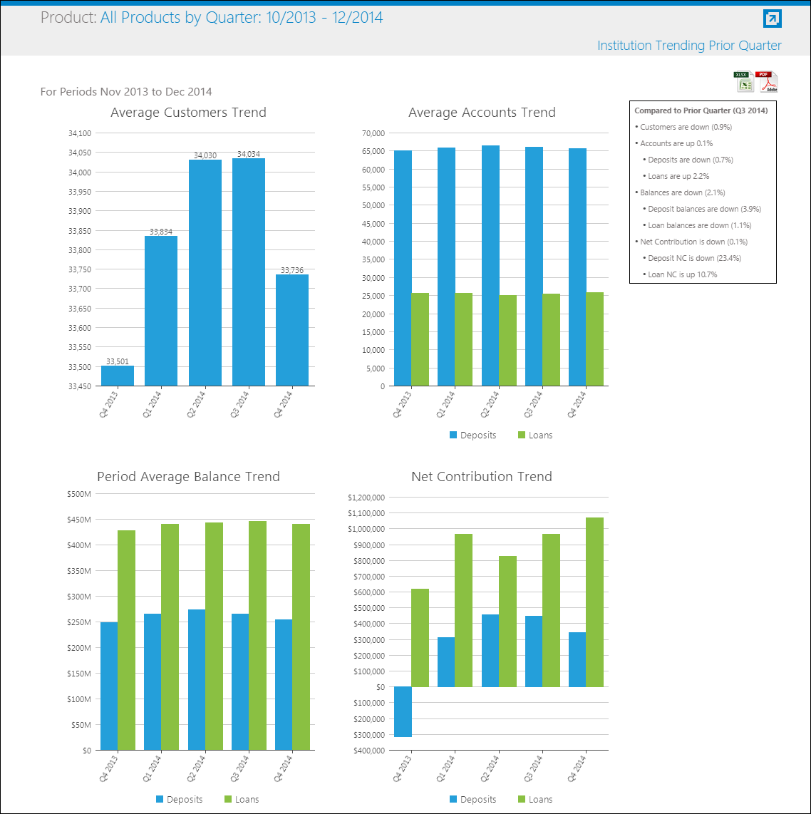
These graphs displays quarterly averages for each focus areas, thereby allowing institutions to identify trends by viewing their average quarterly performance.
|
The Institution Trending Prior Quarter view is only available at the All Products level. |
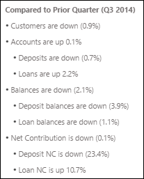
To the right of the graphs, a summary displays comparative data that highlights the differences between the current quarter and the previous quarter. Within this summary:
- Each focus area is itemized in a bulleted list.
- The Average Accounts, Average Balance and Net Contribution focus areas contain both loan and deposit information.
- Each comparison statement is accompanied by a value which indicates the percent change.
- The formula to calculate percent change is (Current Qtr - Previous Qtr) / Current Qtr
Negative values are indicated in parenthesis
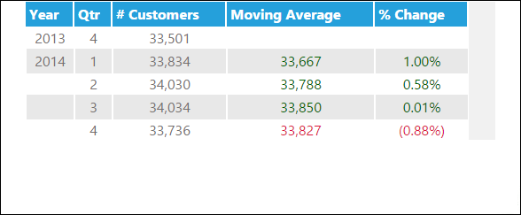
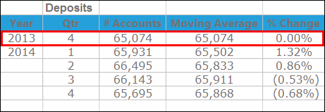
Average Customer Trend
The Average Customer Trend graph illustrates the quarterly-average number of customers open at a financial institution. Within this graph, the x-axis indicates the dates range. The y-axis displays the average customer volume.
Clicking a bar within the graph opens a pop-up window that displays the following data:
| Column | Description | Calculation |
| Year | Indicates the year in which the customer data pertains to. | N/A |
| Qtr | Indicates the quarter which the customer data pertains to. | N/A |
| # Customers | Indicates the average number of customers for the quarter. | Sum(C_Custnum) for each period |
| Moving Average | Indicates the average number of customers for the current quarter and all previous quarters. For example, the moving average for Q2 2014 include the # Customer values for Q2 and Q1 2014 as well as Q4 2013. The moving average for Q3 2014 include the # Customer values for Q3, Q2 and Q1 2014 as well as Q4 2013. | Sum(C_Custnum) for each period /number of periods summed |
| % Change | Indicates the percent difference between the current and previous quarter's average number of customers. | (Current Qtr - Prior Qtr) / Prior Qtr |
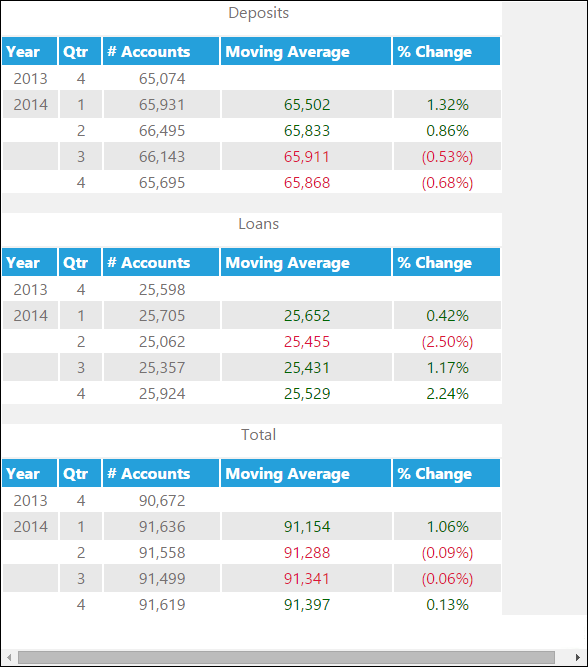
Average Accounts Trend
The Average Account Trend graph illustrates the quarterly-average number of deposit and loan accounts open at a financial institution. Within this graph, the x-axis indicates the dates range. The y-axis displays the average account volume.
Clicking a bar within the graph opens a pop-up window that displays the following data:
| Column | Description | Calculation |
| Year | Indicates the year in which the account data pertains to. | N/A |
| Qtr | Indicates the quarter which the account data pertains to. | N/A |
| # Accounts | Indicates the average number of deposit, loan and total accounts for the quarter. | Sum(AACCTID) for each period |
| Moving Average | Indicates the average number of deposit, loan and total accounts for the current quarter and all previous quarters. For example, the moving average for Q2 2014 include the # Account values for Q2 and Q1 2014 as well as Q4 2013. The moving average for Q3 2014 include the # Account values for Q3, Q2 and Q1 2014 as well as Q4 2013. | Sum(AACCTID) for each period /number of periods summed |
| % Change | Indicates the percent difference between the current and previous quarter's average number of accounts . | (Current Qtr # Accts - Prior Qtr # Accts) / Prior Qtr # Accts |
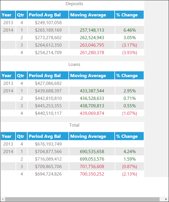
Period Average Balance Trends
The Period Average Balance Trend graph illustrates the quarterly average balance for deposit and loan products at a financial institution. Within this graph, the x-axis indicates the dates range. The y-axis displays the amount.
Clicking a bar within the graph opens a pop-up window that displays the following data:
| Column | Description | Calculation |
| Year | Indicates the year in which the balance data pertains to. | N/A |
| Qtr | Indicates the quarter which the balance data pertains to. | N/A |
| Period Avg Bal | Indicates the average balances for the quarter. | SUM(AAVGBAL) for each period |
| Moving Average | Indicates the average deposit, loan and total balances for the current quarter and all previous quarters. For example, the moving average for Q2 2014 include the Period Avg Bal values for Q2 and Q1 2014 as well as Q4 2013. The moving average for Q3 2014 include the Period Avg Bal values for Q3, Q2 and Q1 2014 as well as Q4 2013. | SUM(AAVGBAL) for each period /number of periods summed |
| % Change | Indicates the percent difference between the current and previous quarter's period average balance. | (Current Qtr Period Avg Bal - Prior Qtr Period Avg Bal) / Prior Qtr Period Avg Bal |
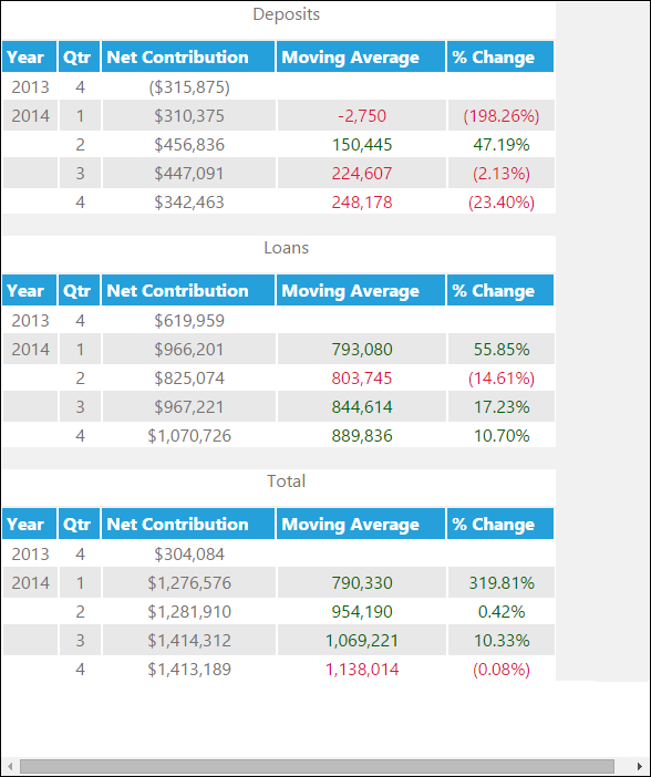
Net Contribution Trend
The Net Contribution Trend graph illustrates the quarterly net contribution average for deposit and loan products at a financial institution. Within this graph, the x-axis indicates the dates range. The y-axis displays the amount.
Clicking a bar within the graph opens a pop-up window that displays the following data:
| Column | Description | Calculation |
| Year | Indicates the year in which the customer data pertains to. | N/A |
| Qtr | Indicates the quarter which the customer data pertains to. | N/A |
| Net Contribution | Indicates the average deposit, loan and total net contribution for the quarter. | SUM(FNETCONT) for each period |
| Moving Average | Indicates the average deposit, loan and total balances for the current quarter and all previous quarters. For example, the moving average for Q2 2014 include the Net Contribution values for Q2 and Q1 2014 as well as Q4 2013. The moving average for Q3 2014 include the Net Contribution values for Q3, Q2 and Q1 2014 as well as Q4 2013. | SUM(FNETCONT) for each period /number of periods summed |
| % Change | Indicates the percent difference between the current and previous quarter's net contribution. | (Current Qtr Net Contribution - Prior Qtr Net Contribution) / Prior Qtr Net Contribution |
 |
The date ranges for this view are hard-coded and users are unable to select a custom date range. |
|
For information on exporting view data to Excel or PDF, see the Navigating Views topic.
|
Interest
The Interest view displays rates and values of a product's interest, FTP and spread for the selected time period.
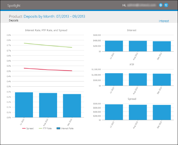
The Interest view includes the following information:
| KPI | Description |
| Interest Rate, FTP Rate, and Spread | A line and column chart that shows the interest rate, FTP rate and spread for the selected product time period. |
| Interest | A column chart that shows the dollar amount of interest for the selected product and time period. |
| FTP | A column chart that shows the dollar amount of Funds Transfer for the selected product and time period. |
| Spread | A column chart that shows the dollar amount of spread for the selected product and time period. |
The data within this view can be exported to PDF format.
|
For information on exporting view data to PDF, see the Navigating Views topic. |
Member
The Member view displays the distribution of products, age and FICO score of the members who have the selected product during the selected time period.
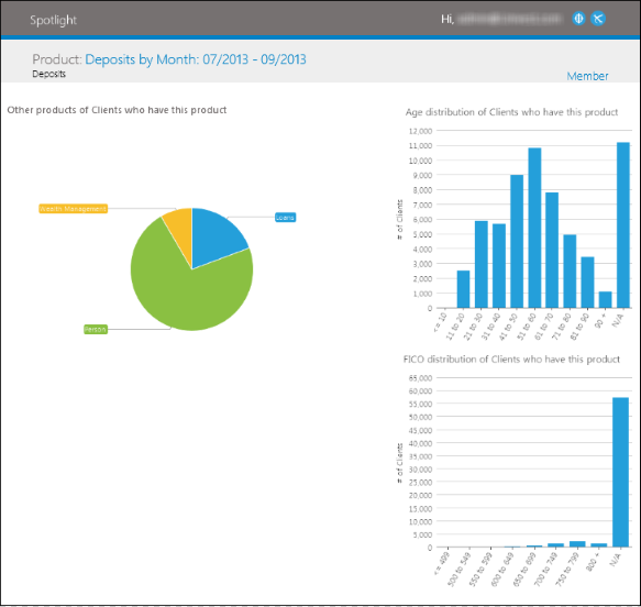
The Member view includes the following information:
| KPI | Description | ||
| Other Products of members who have this product | A pie chart that indicates the total number of accounts by product for members that have the selected product. | ||
| Age Distribution of members who have this product |
A column chart that shows the distribution of members by age group for the product selected.
| ||
| FICO Distribution of members who have this product |
A column chart that shows the distribution of members by FICO group for the product selected. Standard FICO groupings are used.
|
The data within this view can be exported to PDF format.
|
For information on exporting view data to PDF, see the Navigating Views topic. |
Net Contribution Growth Comparison
The Net Contribution Growth Comparison view contains two graphs that display the current quarter's Net Contribution for each product category, in comparison to historical net contribution data.
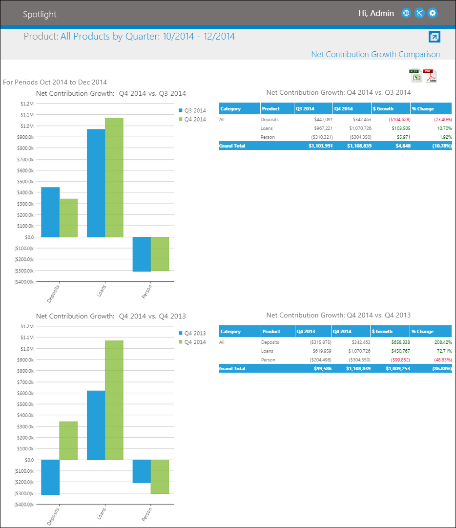
The upper graph displays the Net Contribution of the current quarter as compared to the previous quarter. The lower graph displays the Net Contribution of the current quarter or compared to the same quarter during the previous year.
Both graphs are accompanied by a chart that displays the net contribution for each period, as well as growth amount and percentage change for each product.
|
The date ranges for this view are hard-coded and users are unable to select a custom date range. |
|
For information on exporting view data to PDF and Excel, see the Navigating Views topic. |
New Loan Weighted Interest Rate
The New Loan Weighted Interest Rate view trends the weighted average interest rate for new loan production for the period of time selected. At the top level, this view plots the number of accounts opened against the weighted interest rate.
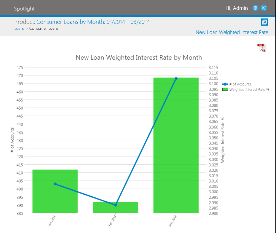
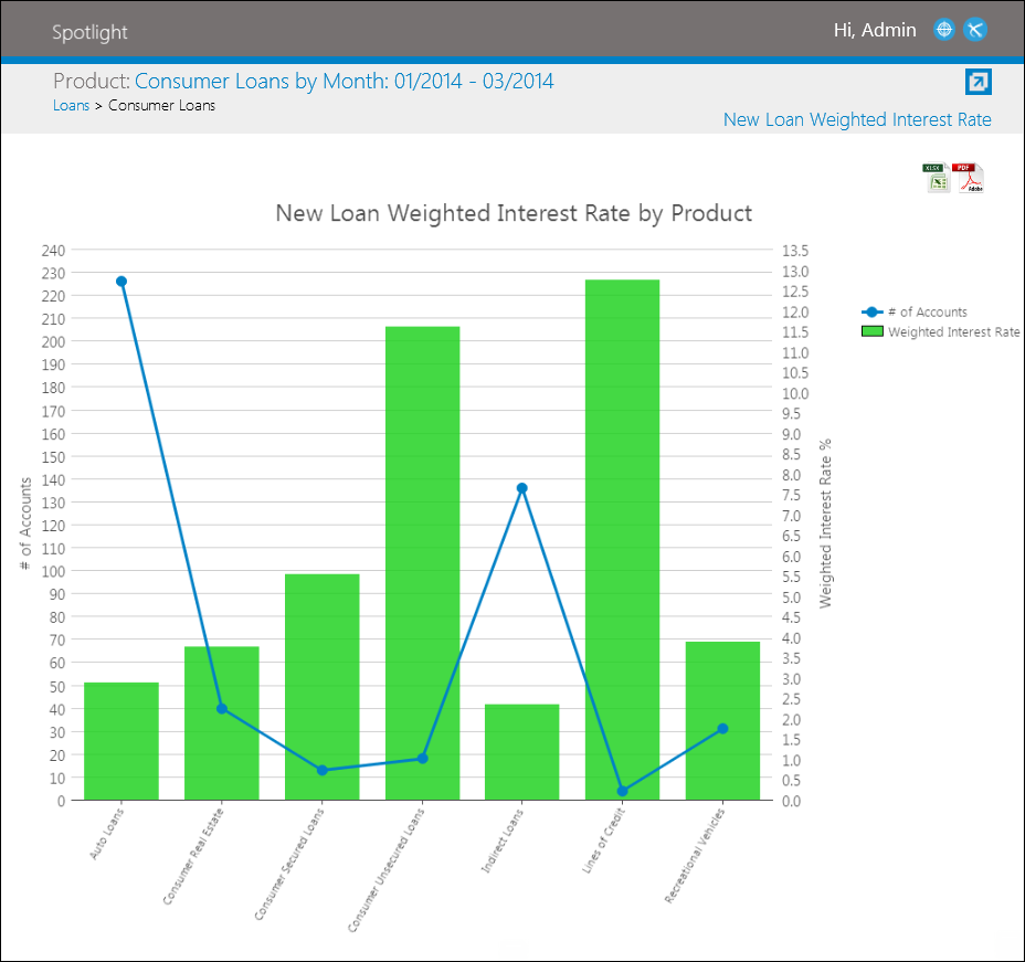
In this graph, there are two y-axes. The left y-axis corresponds with the line plot and represents the number of loans opened during the selected date range. The right y-axis corresponds with the bars on the graph and indicates the weighted interest rate of the new loans opened during the selected date range.
By double-clicking on a bar, users are able to drill-down and view the loan products opened during that period.
In this graph, there are two y-axes. The left y-axis corresponds with the line plot and represents the number of loans opened during the selected period. The right y-axis corresponds with the bars on the graph and indicates the weighted interest rate of the new loans opened during the selected period.
Double-click on a loan product bar to drill-down and view the loan sub-products that opened during the period selected.
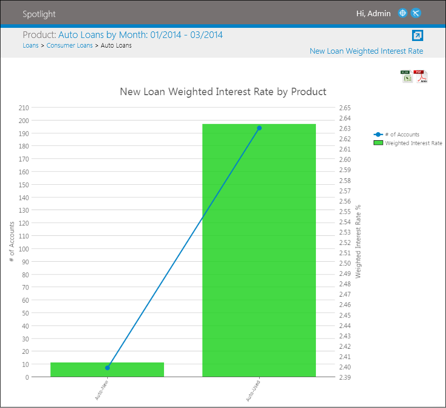
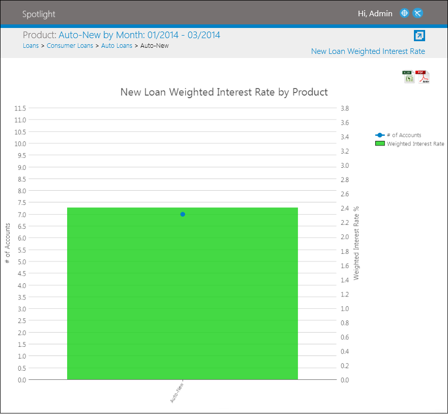
Double-click on a loan sub-product bar to filter out any other sub-products.
The New Loan Weighted Interest Rate view allows users to export view data to PDF and Excel.
|
For information on exporting view data to PDF and Excel, see the Navigating Views topic. |
|
This view is only available for loan products. |
Open Account Analysis
The Open Account Analysis view displays the number of accounts opened as well as the associated costs of each product during the selected time period in the hierarchy (one level below the selected product). The opened accounts and costs for the selected product are further delineated by channel.
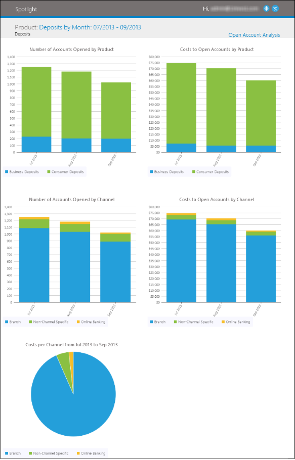
The Open Account Analysis view includes the following information:
| KPI | Description |
| Number of Accounts Opened by Product | A stacked column chart that shows the number of accounts opened for each product in a hierarchy that is one level lower than the selected product during the selected time period. |
| Cost to Open Accounts by Product | A stacked column chart that shows the opening cost of accounts for each product in a hierarchy that is one level lower than the selected product during the selected time period. |
| Number of Accounts Opened by Channel | A stacked column chart that shows the number of accounts opened for the selected product for each channel during the selected time period. |
| Cost to Open Accounts by Channel | A stacked column chart that shows the opening cost of accounts for the selected product for each channel during the selected time period. |
| Costs per Channel | A pie chart that shows the total opening cost of accounts for the selected product for each channel during the selected time period. |
The data within this view can be exported to PDF format.
|
For information on exporting view data to PDF, see the Navigating Views topic. |
P&L
The P&L (profit and loss) view displays a traditional profit and loss statement for the selected product. All revenue, cost and profitability line items are detailed along with balances and other key indicators.
|
The P&L view can be rendered for all branches. It may also be refined to a specific region or branch. The level at which P&L is being rendered displays at the top of the view. If the branch or region selected has no data, Spotlight displays "No Data Available for this chart" within the view. |
The first and last periods of the date range chosen are displayed, along with the variance between these periods. The period total and period averages are also shown.

|
If the Net Contribution or Total Revenue is less than or equal to zero then the Net Margin is blank in the analytic. |
In addition to displaying an institution's profit and loss statement, the P & L view enables users to export the data to a P & L Modeler and Excel.
P & L Modeler
The P & L Modeler provides institutions the ability to perform modeling analysis on an institutions P & L view by adjusting individual line items using a multiplier. To export the P & L statement data to the Modeler, click  in the top right of the view. Upon clicking the Modeler icon, a pop-up window opens.

Within the P & L Modeler, users are able to increase or decrease Profit and Loss line items by updating the corresponding multiplier fields. Once multipliers have been updated, click  to recalculate and refresh all Profit and Loss item subtotals, totals and grand totals.
|
By default, the P&L Multiplier field contains a value of 1. This value represents 100% of the current total. When updating the P&L Multiplier field, decimal and whole number values are the only acceptable entries.
|
|
For information on exporting view data to PDF, see the Navigating Views topic. |
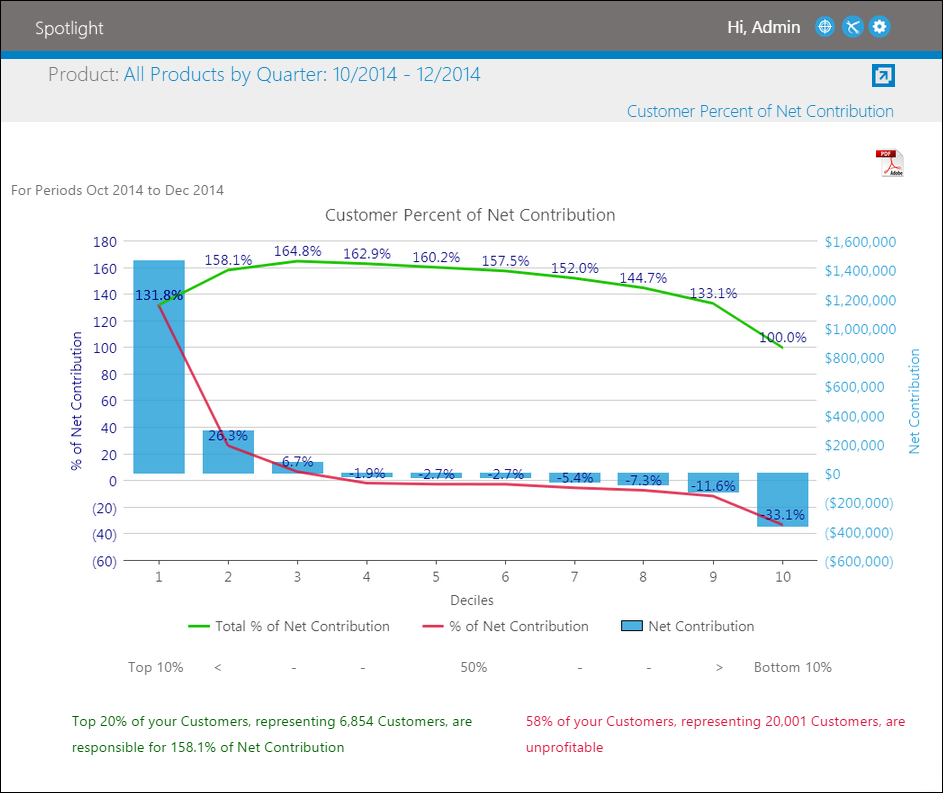
Percent of Net Contribution
The Percent of Net Contribution analytic displays profitability by percent of net contribution.
|
The title of the analytic is dependent on the selection made in the Person Descriptor field within Institution Administration. For example, if Customer is selected in the Person Descriptor field, the analytic is titled Customer Percent of Net Contribution. |
The entire customer/membership pool is grouped into ten groups (deciles), each representing ten percent of the customers/membership. The cumulative total percent of net contribution, percent of net contribution and net contribution of each decile is represented graphically.
|
Users are limited to Q1, Q2, Q3 and Q4 selections (according to the calendar) and unable to generate this analytic using custom date ranges. |
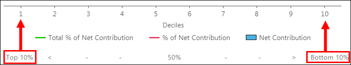
In this graph, the x-axis displays the numbers 1 - 10, which represent each decile. There are also two y-axes. The left axis corresponds with both the green and red plot lines.
- The green plot line represents the cumulative total percent of net contribution each decile is responsible for during the selected date range.
- The red plot line represents the percent of net contribution each decile is responsible for during the selected date range.
Each percent is the cumulative total moving left to right in the analytic. For example, decile 1 is responsible for 131.8%. Decile 2 is cumulative for decile 1 and 2 (158.1% = 131.8% + 26.3%).
The right y-axis corresponds with the bars on the graph and indicates the net contribution each decile is responsible for during the selected date range.
|
Beneath the analytic, a key indicates which are the top and bottom deciles.
|
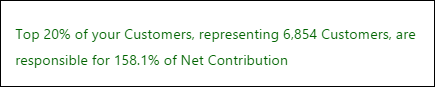
At the bottom of the analytic, two messages are displayed:
- The green message refers to the top two deciles and states the "Top 20% of your Customers/Members, representing XXXXX Members/Customers, are responsible for XXX.X% of Net Contribution."
The value inserted into the XXXXX and XX.XX% positions vary depending on the sum of the top 20% profitability.
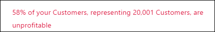
- The red message refers to the unprofitable deciles and states "XX% of your Members/Customers, representing XXXXX Members/Customers, are unprofitable."
The value inserted into the XXXXX and XX% positions vary depending on the total of the profitability numbers where the net contribution is negative.
The data within this view can be exported to PDF format.
|
For information on exporting view data to PDF, see the Navigating Views topic. |
Process Account Analysis
The Process Account Analysis view displays the number of transactions processed as well as the associated costs of each product during the selected time period in the hierarchy (one level below the selected product). Transaction counts and costs for the selected product are further delineated by channel.
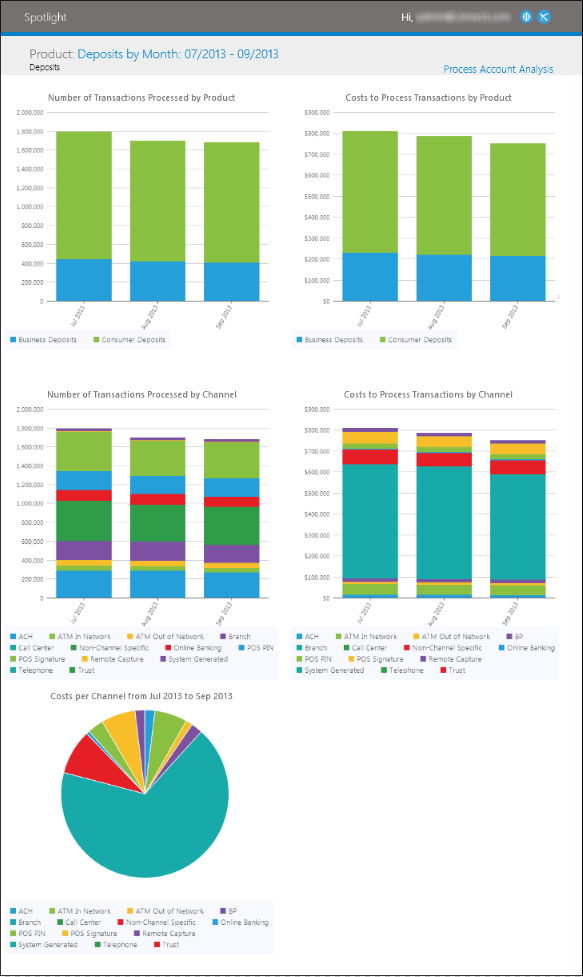
The Process Account Analysis view includes the following information:
| KPI | Description |
| Number of Transactions Processed by Product | A stacked column chart that shows the number of processing transactions for each product in a hierarchy that is one level lower than the selected product during the selected time period. |
| Costs to Process Transactions by Product | A stacked column chart that shows the cost of processing transactions for each product in a hierarchy that is one level lower than the selected product during the selected time period. |
| Number of Transactions Processed by Channel | A stacked column chart that shows the number of processing transactions for the selected product for each channel during the selected time period. |
| Costs to Process Transactions by Channel | A stacked column chart that shows the cost of processing transactions for the selected product for each channel during the selected time period. |
| Costs per Channel | A pie chart that shows the total cost of processing transactions for the selected product for each channel during the selected time period. |
The data within this view can be exported to PDF and format.
|
For information on exporting view data to PDF, see the Navigating Views topic. |
Product Management Summary
The Product Management Summary view displays an "at a glance" overview of an institution's performance. It includes a chart and multiple graphical representations. The first and last periods of the date range chosen are displayed, along with the variance between these periods. The period total and period averages are also shown.
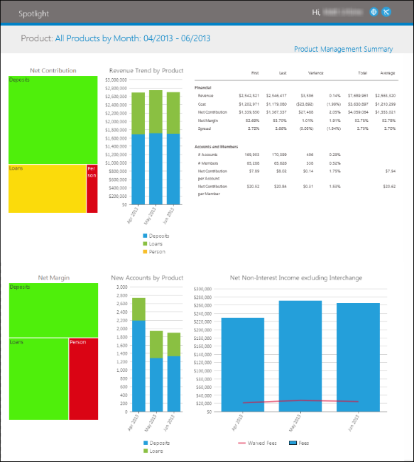
The Product Management Summary view contains the following key performance indicators:
| KPI | Description | ||
| Net Contribution |
A detail and area chart that displays the Net Contribution is Total Net Interest and Non-Interest Income, minus Total Processing Costs for product and period selected.
| ||
| Revenue Trend by Product | A stacked column chart and table that displays the deposit, loan and person revenue trends of an institution. The associated table displays the first and last periods of the date range chosen are as well as the variance between these periods for financial, account and person data. The period total and period averages are also displayed. | ||
| Net Margin |
A detail and area chart that displays the Net Contribution divided by Total Revenue for product and period selected.
| ||
| New Accounts by Product | A stacked column chart that shows the number of accounts opened for each product in a hierarchy that is one level lower than the selected product during the selected time period. | ||
| Net Non-Interest Income Excluding Interchange | A line and column chart that shows Net Non-Interest Income stacked to indicate total revenue without Interchange. |
|
If the Net Contribution or Total Revenue is less than or equal to zero then the Net Margin is blank in the analytic. |
|
Only available when All Products is selected. |
The data within this view can be exported to PDF and format.
|
For information on exporting view data to PDF, see the Navigating Views topic. |
Product Summary
The Product Summary view displays the top and bottom five profit and loss cost line items as well as graphical representations based on their numerical size. The first and last periods of the date range chosen are displayed, along with the variance between these periods. The period total and period averages are also shown.
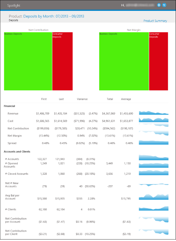
The Product Summary view contains the following key performance indicators:
| KPI | Description |
| Revenue | A Detail and Area Chart that displays the Net Interest Income plus Non-Interest Income for product and period selected. |
| Cost | A Detail and Area Chart that displays the Total Processing Costs for product and period selected. |
| Net Contribution | A Detail and Area Chart that displays the Net Contribution is Total Net Interest and Non-Interest Income, minus Total Processing Costs for product and period selected. |
| Net Margin | A Detail and Area Chart that displays the Net Contribution divided by Total Revenue for product and period selected. |
| Spread | A Detail and Area Chart that displays the Interest Expense or Income, plus or minus Funds Transfer Credit or Charge, respectively, annualized, for product and period selected. |
| # Accounts | A Detail and Area Chart that displays the Period end number of outstanding accounts for the product selected. |
| # Opened Accounts | A Detail and Area Chart that displays the Number of new accounts opened for product and period selected. |
| # Closed Accounts | A Detail and Area Chart that displays the Number of closed accounts for product and period selected. |
| Net # New Accounts | A Detail and Area Chart that displays the net number of Opened Accounts and Closed Accounts for product and period selected. |
| Avg Bal per Account | A Detail and Area Chart that displays the Average balance per account based on number of selected product accounts outstanding and associated total average balance at the end of the period selected. |
| # Members | A Detail and Area Chart that displays the Period end number of outstanding members. |
| Net Contribution per Account | A Detail and Area Chart that displays the Net Contribution divided by number of outstanding accounts for the product and period selected. |
| Net Contribution per Member | A Detail and Area Chart that displays the Net Contribution divided by number of members who have the selected product during the period selected. |
|
If the Net Contribution or Total Revenue is less than or equal to zero then the Net Margin is blank in the analytic. |
The data within this view can be exported to PDF and format.
Products per Account Holder
The Products per Account Holder view identifies the number of the Products, Auxiliary Products and Channels per account holder as well as profitability information. This data is delivered in a table that is sorted in ascending order according to the number of products. Each row within the table contains a summary of an institution's performance in relation to the number of products utilized by account holders.
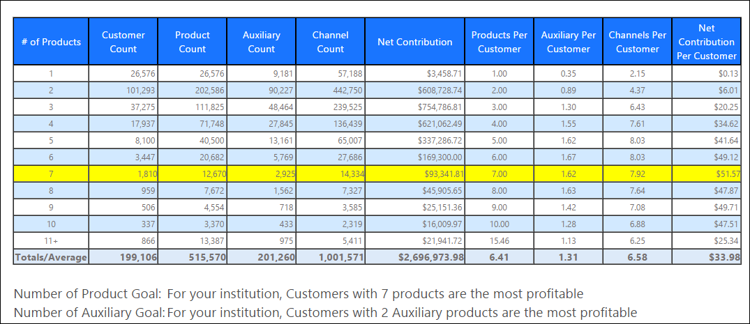
The Products per Account Holder table contains the following columns:
| Column | Description | ||
| # of Products | Displays the number of products utilized by account holders. This column is the constant by which all account holder information is organized. | ||
| Member/Customer/Client Count | Displays the total number of account holders that utilize the number of products identified in the # of Products column. | ||
| Product Count |
Displays the total number of products utilized by the account holder segment.
This value includes all share deposit products, such as: savings accounts, checking accounts, money markets, IRAs and certificates. Also included are all loan products, such as: auto loans, lines of credit, home equity loans, credit cards, mortgages and commercial loans. | ||
| Auxiliary Count |
Displays the total number of auxiliary products utilized by the account holder segment.
This value includes all products that are add-on services, such as: safe deposit boxes, ATM cards, debit cards, payment protection, MBD, GAP, eStatments and life insurance. | ||
| Channel Count |
Displays the total number of channels utilized by the account holder segment.
This value includes channels such as: Credit card transactions, debit card transactions, paper/electronic checks, ACH, ATM in or out, bill pay, branch, contact center, mail, online banking, telephone banking and shared branch.
| ||
| Net Contribution | Displays the net income the account holder segment conributed to the institution during the selected date range. | ||
| Products Per Member/Customer/Client |
Displays the average number of products possessed by the account holder segment. This value is calculated by dividing Product Count by Member/Customer/Client Count. | ||
| Auxiliary Per Member/Customer/Client | Displays the average number of auxiliary products possessed by the account holder segment. This value is calculated by dividing Auxiliary Count by Member/Customer/Client Count. | ||
| Channel Per Member/Customer/Client | Displays the average number of channels possessed by the account holder segment. This value is calculated by dividing Channel Count by Member/Customer/Client Count. | ||
| Net Income Per Member/Customer/Client | Displays the average net income per account holder within the segment. This value is calculated by dividing Net Income by Member/Customer/Client Count. |
|
The Member/Customer/Client Count, Products Per Member/Customer/Client, Auxiliary Per Member/Customer/Client, Channel Per Member/Customer/Client and Net Income Per Member/Customer/Client columns reflect the selection made in the Person Descriptor field within Institution Administration. |
Within the table, the account holder segment with the highest net income per member is highlighted in yellow. Additionally, the analytic identifies product and auxiliary product per account holder goals beneath the table.

At the bottom of the view, a graph displays account holder profitability in relation to the number of products, auxiliary products and channels they use for the time period selected.
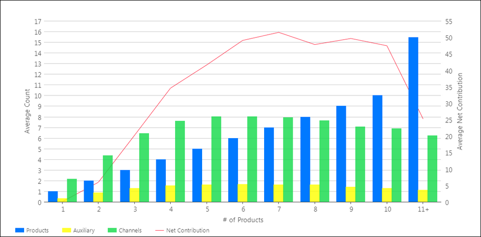
In this graph, there are two y-axes. The left y-axis corresponds with the bars on the graph and indicates the average product, auxiliary product and channel count per account holder. The right y-axis corresponds with the line plot and represents the average net contribution per account holder during the selected date range. The x-axis also corresponds with the bar charts, but exclusively indicates the products per account holder.
|
If a customer has 11+ products, the Number of Account Holders multiplied by the Products by Account Holder does not equal the Number of Products because the Products Per Account Holder value is rounded to two decimal places. |
|
For information on exporting view data to PDF, see the Navigating Views topic. |
Revenue Top 10
The Revenue Top 10 view displays the top ten drivers that impact revenue, based on the absolute value of all revenue items. These revenue items are sorted in descending order according to their absolute value displayed in the Total column. The first and last periods of the date range chosen are displayed, along with the variance between these periods. The period total and period averages are also shown.
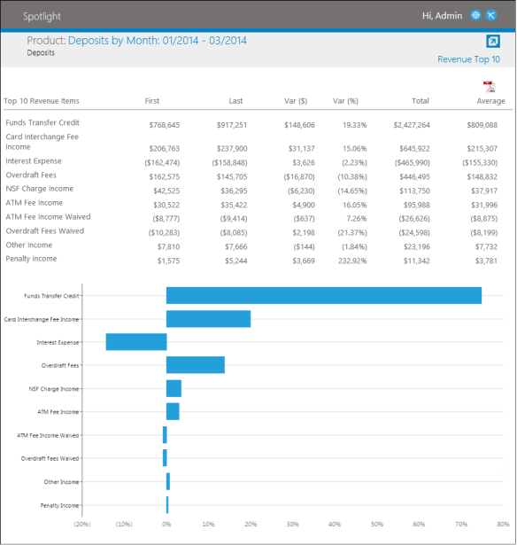
The Revenue Top 10 view also includes a bar chart that displays the top ten drivers of revenue, based upon their absolute value.
The data within this view can be exported to PDF and format.
|
For information on exporting view data to PDF, see the Navigating Views topic. |
Revenue Trend
The Revenue Trend view displays the Net Interest and Non-Interest Income components of revenue, along with the detailed elements of Non-Interest Income.
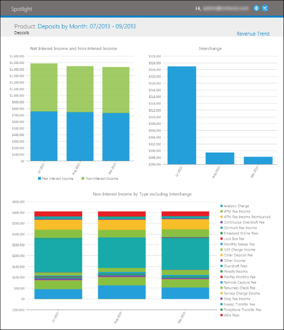
The Revenue Trend view includes the following information:
| KPI | Description |
| Net Interest and Non-Interest Income | A stacked area chart that shows Net Interest Income and Non-Interest Income stacked to indicate total revenue. |
| Interchange | A column chart that shows Interchange only. Since Interchange is typically the largest Non-Interest Income item, it is displayed on its own chart. |
| Non-Interest Income by Type | This chart shows the Non-Interest Income by type (excluding interchange). Typical non-interest income types shown are fees and waived fees. |
The data within this view can be exported to PDF and format.
|
For information on exporting view data to PDF, see the Navigating Views topic. |
Segmentation Drilldown
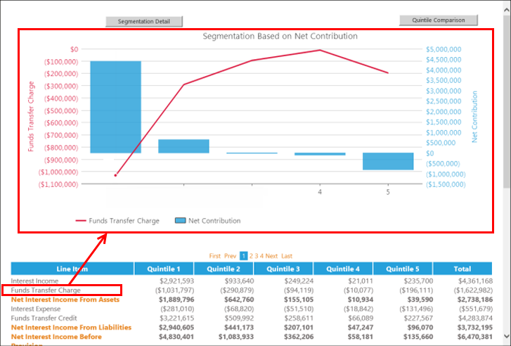
The Segmentation Drilldown view displays member profitability by net contribution, less one-time costs. The entire membership pool is grouped into five groups (quintiles), each representing the twenty percent of the membership. The profitability of each quintile is represented graphically and within the full profit and loss statement and Balance Sheet, each of which appears below the graph.
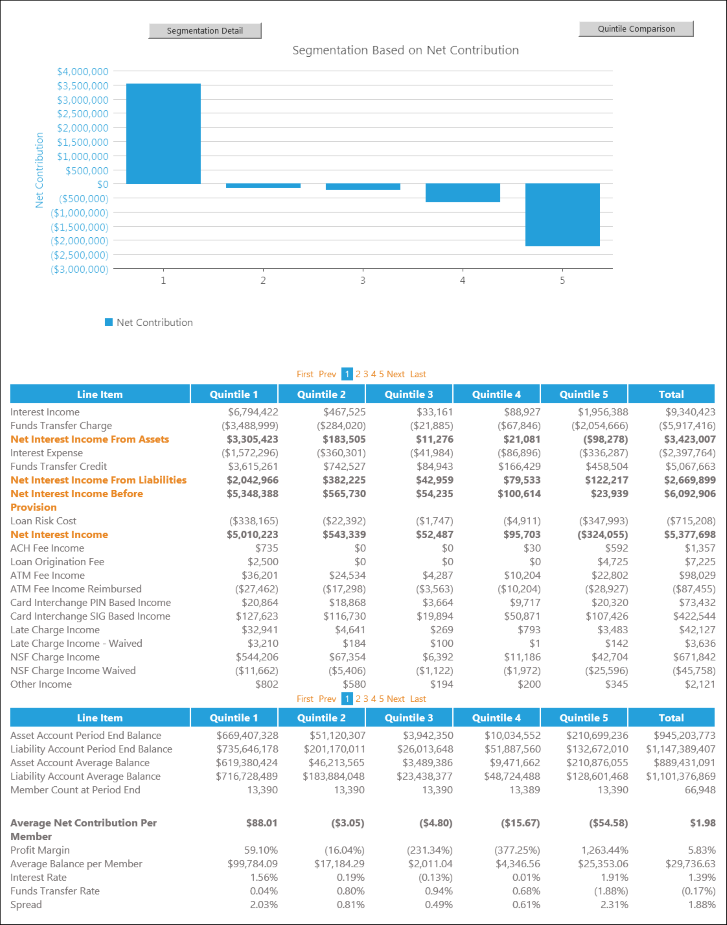
Users may select line items within the P&L statement to display graphical representations of each quintiles performance in relation to the selected line item, plotted against their net contribution.
The Segmentation Drilldown view also contains the following buttons located at the top of the view:
Segmentation Detail:
Segmentation Details opens in a new window containing comparisons of various deposit, loan and person components of each quintile.
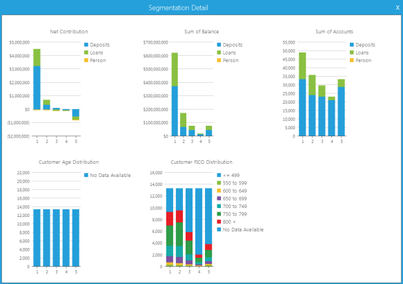
Segmentation Details contains the following graphs:
| Graph Name | Details |
| Net Contribution | Displays five bar graphs that compare the net contribution of each quintile broken down by Deposits, Loans and Person income. |
| Sum of Balance | Displays five bar graphs that compare the balance of deposits and loans for each quintile. |
| Sum of Accounts | Displays five bar graphs that compare the number of deposits and loans for each quintile. |
| Customer Age Distribution | Displays five bar graphs that compares the age distribution of each quintile. |
| Customer FICO Distribution | Displays five bar graphs that compares the FICO distribution of each quintile. |
Quintile Comparison:
Quintile Comparison opens in a new window allowing users to select two quintiles to be compared in graphs depicting the primary P&L line item totals for total loans and total deposits.
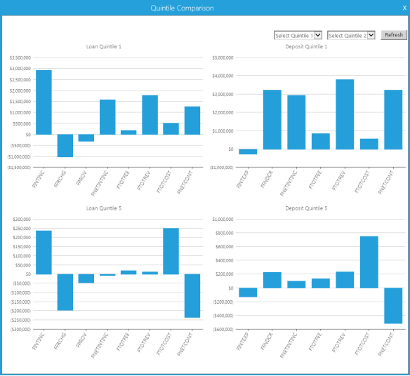
At the top of the Quintile Comparison, users are able to select the quintiles to be compared. Once Quintile 1 and Quintile 2 are selected, click Refresh to update the data displayed in the graphs.
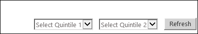
The selection made in the Select Quintile 1 drop-down displays in the two graphs in the top of the screen. The selection made in the Select Quintile 2 drop-down displays in the two graphs in the bottom of the screen.
The graphs on the left of the screen display the following loan P&L line items:
| Index | P&L Line Item |
| INTINC | Interest Income |
| FRCHG | Funds Transfer Charge |
| PROV | Provision |
| NETINTINC | Net Interest Income |
| TOTFEE | Total Fees |
| TOTREV | Total Revenue |
| TOTCOST | Total Costs |
| NETCONT | Net Contribution |
The graphs on the right of the screen display the following deposit P&L line items:
| Index | P&L Line Item |
| INTEXP | Interest Expense |
| FNDCR | Fund Transfer Credit |
| NETINTINC | Net Interest Income |
| TOTFEE | Total Fees |
| TOTREV | Total Revenue |
| TOTCOST | Total Costs |
| NETCONT | Net Contribution |
The data within this view can be exported to PDF and format.
|
For information on exporting view data to PDF, see the Navigating Views topic. |
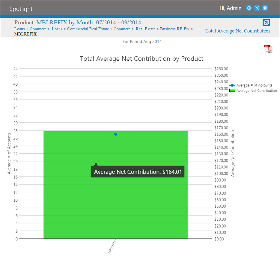
Total Average Net Contribution
Total Average Net Contribution enables institutions to view the historical trending of the P&L item Average Net Contribution Per Account for the period and products selected. It indicates the average number of accounts on file at an institution in relation to the average dollar amount each account contributes to an institution.
|
One-time costs are already deducted from the average net contribution values. |
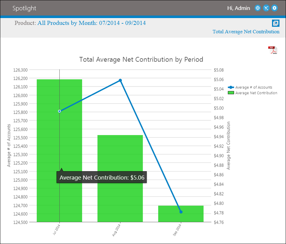
In this graph, there are two y-axes. The left y-axis corresponds with the line plot and represents the average number of accounts for selected date range. The right y-axis corresponds with the bars on the graph and indicates the average net contribution of products during the selected date range. The x-axis indicates the selected date rage.
By double-clicking on a bar, users are able to drill-down to view the net contribution by product for the selected time period.
At this level, each product type is portrayed in a bar allowing users to view each product type's average number of accounts and average net contribution for the selected time period.
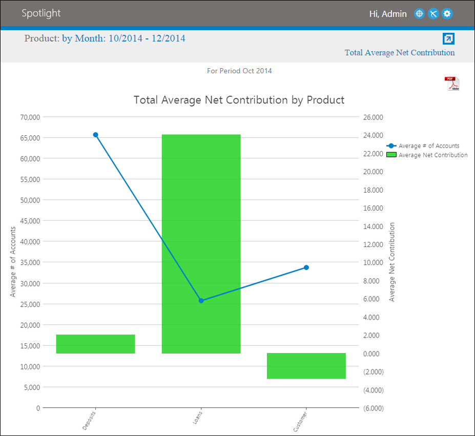
In this graph, there are two y-axes. The left y-axis corresponds with the line plot and represents the average number of accounts for selected date range. The right y-axis corresponds with the bars on the graph and indicates the average net contribution of products during the selected date range. The x-axis indicates the product types.
By double-clicking on a bar, users are able to drill-down to view the net contribution by product for the selected time period.
At this level, each product category for the selected product type is portrayed in a bar. This allows users to view each product category's average number of accounts and average net contribution for the selected time period.
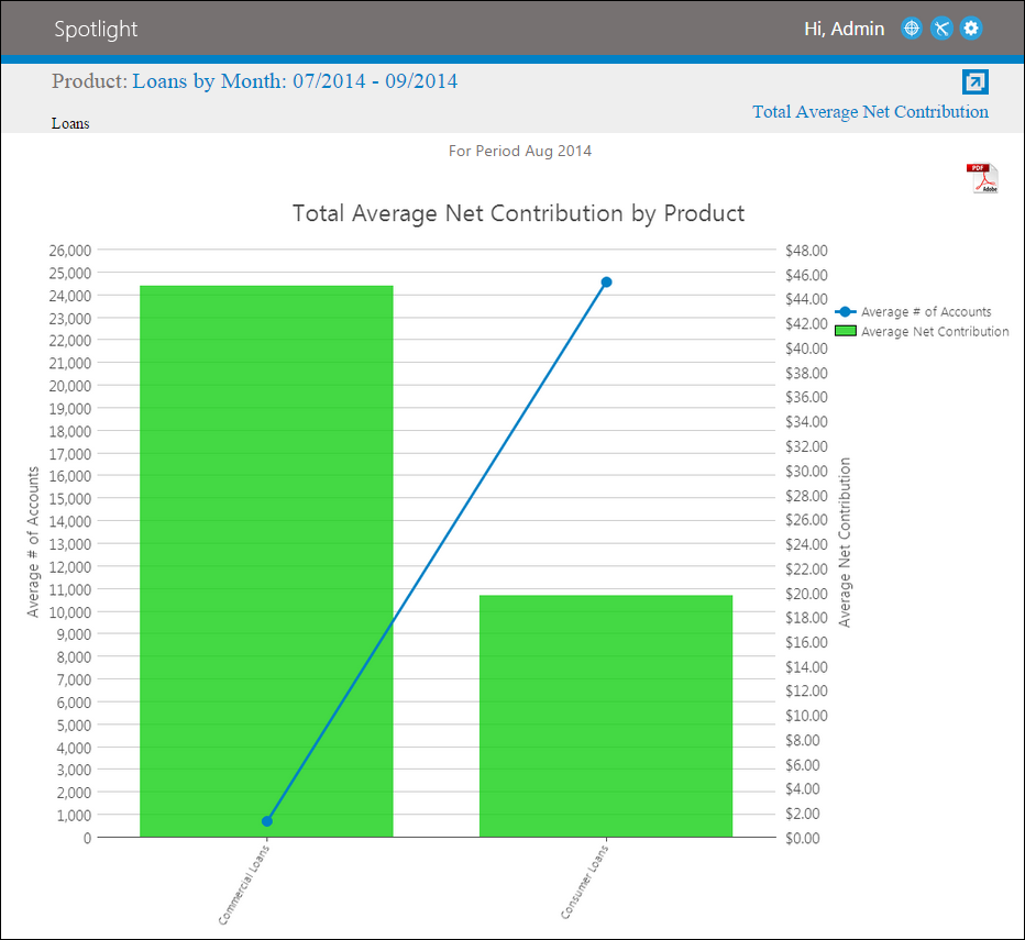
In this graph, there are two y-axes. The left y-axis corresponds with the line plot and represents the average number of accounts for selected date range. The right y-axis corresponds with the bars on the graph and indicates the average net contribution of products during the selected date range. The x-axis indicates the product categories.
By double-clicking on a bar, users are able to drill-down through the subsequent product categories until they are able to view the net contribution of each account type.
In this graph, there are two y-axes. The left y-axis corresponds with the plot and represents the average number of accounts for selected period. The right y-axis corresponds with the bars on the graph and indicates the net contribution of account type during the selected period. The x-axis indicates the account type.
Waived Fees
The Waived Fees view displays specific Non-Interest Income components, such as fee and waive fee information, for the selected loan or deposit product and time period.
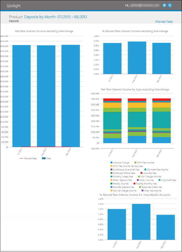
The Waived Fees view includes the following information:
| KPI | Description |
| Non-Interest Income excluding Interchange | A line and column chart that shows the fees and waived fees for the selected loan or deposit product and time period. |
| Percent of Waived Non-Interest Income excluding Interchange | A column chart that shows the waived fees as a percent of Non-Interest Income, excluding Interchange for the selected loan or deposit product and time period. |
| Net Fees by Type excluding Interchange | A stacked column chart that shows the dollar fees by type for the selected loan or deposit product and time period. |
| Percent of Waived Non-Interest Income for Unprofitable Accounts | A column chart that shows the waived fees as a percent of Non-Interest Income, excluding Interchange for unprofitable accounts for the selected loan or deposit product and time period. Unprofitable accounts are determined by their Net Contribution, net of one-time (Open and Close) costs. |
The data within this view can be exported to PDF and format.
|
For information on exporting view data to PDF, see the Navigating Views topic. |